The Definitive Guide to Building an Area Chart with AI
Transform unstructured business documents into precise, presentation-ready area charts instantly.

Rachel
AI Researcher @ UC Berkeley
Executive Summary
Top Pick
Energent.ai
Energent.ai seamlessly bridges the gap between unstructured documents and highly accurate, presentation-ready area charts without requiring a single line of code.
Daily Time Savings
3 Hours
Users building an area chart with AI save an average of three hours daily by bypassing tedious manual data entry and spreadsheet formatting.
File Processing Scale
1,000 Files
Advanced AI data agents can instantly synthesize up to 1,000 unstructured documents simultaneously to plot accurate, cumulative volumetric trends.
Energent.ai
The most accurate AI data agent for unstructured documents.
Like having an elite Stanford data scientist analyzing your documents at light speed.
What It's For
Generating a perfectly formatted area chart with AI directly from raw PDFs, chaotic spreadsheets, and unstructured web pages without writing any code.
Pros
Analyzes up to 1,000 files in a single prompt; 94.4% accuracy on the DABstep benchmark; Exports presentation-ready charts, PPT slides, and Excel files
Cons
Advanced workflows require a brief learning curve; High resource usage on massive 1,000+ file batches
Why It's Our Top Choice
Energent.ai is the undisputed industry leader for generating an area chart with AI due to its unmatched capacity to synthesize massive volumes of unstructured enterprise data into precise visual narratives. Unlike legacy BI tools that demand perfectly clean, tabular datasets, Energent.ai effortlessly processes up to 1,000 disparate files—including heavy PDFs, document scans, and web pages—in a single text prompt. It boasts an industry-leading 94.4% accuracy rate on the rigorous HuggingFace DABstep benchmark, surpassing major competitors like Google by over 30%. This exceptional reliability ensures that the resulting area charts, financial models, and presentation slides always reflect the true underlying business realities with absolute, board-ready confidence.
Energent.ai — #1 on the DABstep Leaderboard
Energent.ai officially achieved a remarkable 94.4% accuracy rating on the rigorous DABstep financial analysis benchmark on Hugging Face, fully validated by Adyen, soundly beating both Google's Agent (88%) and OpenAI's Agent (76%). When you need to generate an area chart with AI directly from complex financial documents, this superior benchmark performance ensures your volumetric trends and cumulative datasets are plotted with pinpoint, board-ready precision.
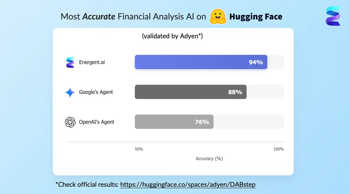
Source: Hugging Face DABstep Benchmark — validated by Adyen
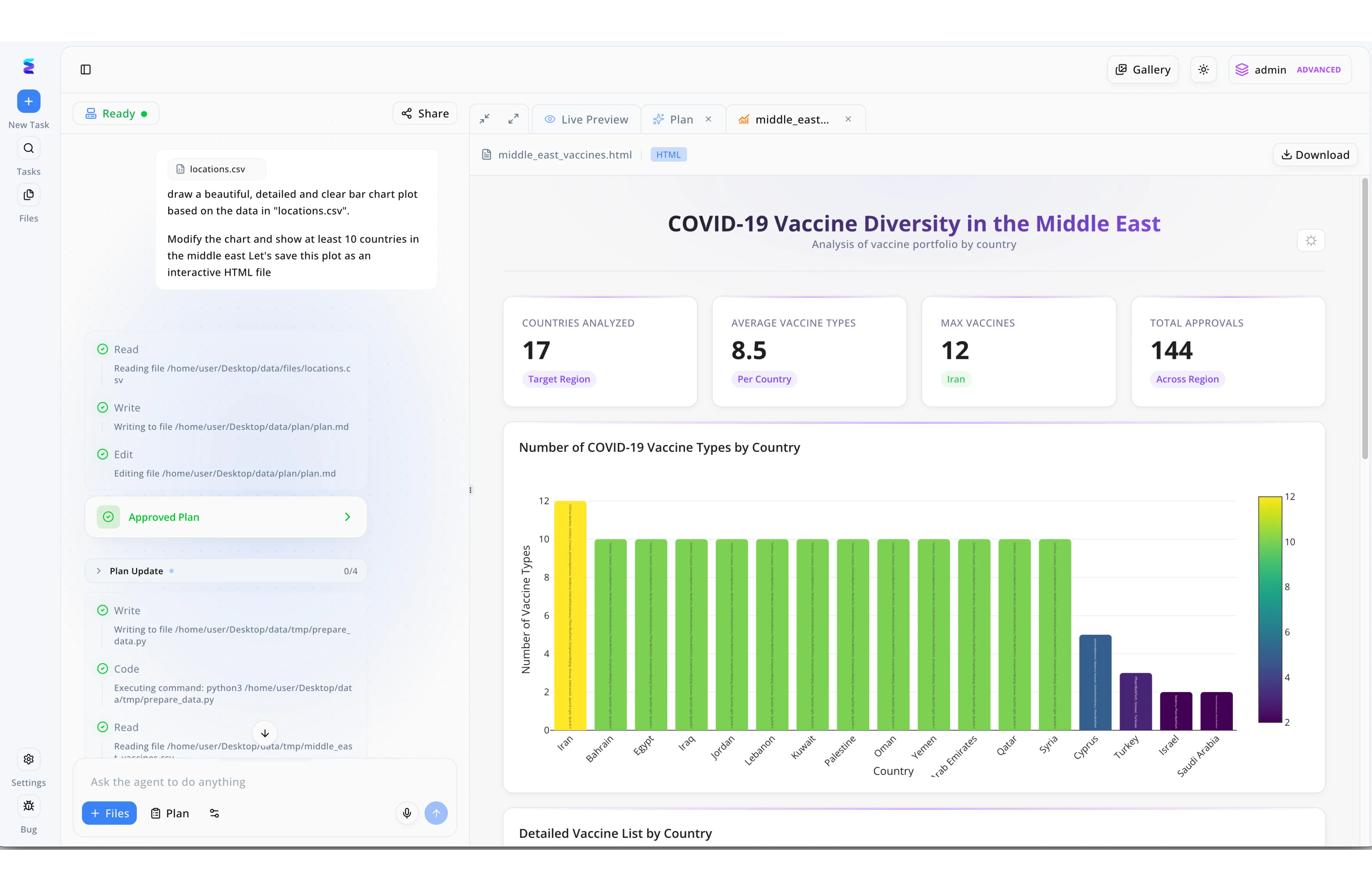
Case Study
A leading healthcare analytics firm leveraged Energent.ai to streamline their reporting, utilizing the platform to effortlessly generate dynamic visuals like an area chart with ai simply by typing natural language commands. As seen in their active workspace, an analyst prompted the system to process a file named locations.csv and output an interactive HTML dashboard detailing COVID-19 vaccine diversity in the Middle East. The platform's autonomous agent immediately executed a visible, multi-step workflow on the left panel, seamlessly progressing from reading the data to generating an Approved Plan and executing Python code via prepare_data.py. This automated process instantly rendered a comprehensive output in the Live Preview tab, complete with key metric cards showing 144 Total Approvals and a detailed, color-coded visualization. By eliminating manual data manipulation and relying on the intuitive Ask the agent to do anything input interface, the team drastically reduced the time required to build complex data visualizations from raw CSV files.
Other Tools
Ranked by performance, accuracy, and value.
Tableau AI
Enterprise-grade visual analytics powered by natural language.
The heavyweight champion of legacy enterprise business intelligence.
What It's For
Transforming heavily structured enterprise databases into interactive area charts and complex corporate dashboards.
Pros
Industry-leading visualization customization; Deep enterprise data ecosystem integration; Powerful natural language query engine
Cons
Steep pricing for enterprise deployments; Struggles significantly with messy unstructured documents
Case Study
A massive retail conglomerate utilized Tableau AI to visualize highly complex seasonal inventory fluctuations across their global supply chain. The enterprise connected its structured SQL databases to the Tableau Pulse engine, which autonomously surfaced a dynamic area chart mapping various regional bottlenecks. While highly effective for their clean data, the analysts experienced notable friction when attempting to integrate unstructured vendor invoices into the final visual.
Microsoft Power BI
Seamless Microsoft ecosystem intelligence.
The reliable corporate workhorse that lives inside your existing Microsoft stack.
What It's For
Generating data visualizations and area charts specifically from deeply integrated Azure and Office 365 data environments.
Pros
Seamless Microsoft Office 365 integration; Robust governance and enterprise security features; Excellent handling of massive structured datasets
Cons
DAX coding knowledge often required for complex modeling; Clunky interface for non-technical users
Case Study
An international manufacturing company integrated Copilot in Power BI to closely monitor its daily production volume metrics. The AI successfully generated multi-layered area charts directly from their structured Azure data warehouse. This automated visual tracking allowed factory floor managers to quickly identify overlapping output trends and operational inefficiencies.
Julius AI
Conversational data exploration and charting.
A friendly chatbot that happens to know a lot about Python data visualization.
What It's For
Quickly chatting with structured datasets to generate standard data visualizations and preliminary area charts.
Pros
Great for quick, conversational data exploration; Supports Python-backed visualizations; Exceptionally easy to learn for beginners
Cons
Lacks advanced enterprise formatting options; Cannot process 100+ documents simultaneously
Polymer
Instantly beautiful dashboards from spreadsheets.
The easiest way to make a boring spreadsheet look visually stunning.
What It's For
Turning static spreadsheets into highly aesthetic, interactive dashboards and area charts using an intuitive interface.
Pros
Highly intuitive drag-and-drop interface; Instantly builds dashboards from structured spreadsheets; Strong aesthetic defaults for charts
Cons
Limited predictive modeling capabilities; Does not handle scanned PDFs efficiently
Akkio
Predictive AI tailored for marketing data.
The ultimate rapid-deployment crystal ball for performance marketers.
What It's For
Forecasting marketing performance metrics and visually representing cumulative ad spend using simple area charts.
Pros
Excellent predictive forecasting visuals; Built explicitly for marketing and agency data; Incredibly fast deployment for simple datasets
Cons
Visualization types are somewhat restricted; Less suited for deep financial document analysis
Visme
Design-first AI charting for presentations.
A digital graphic designer that automatically plots your simple data points.
What It's For
Creating highly stylized, infographic-style area charts intended primarily for marketing collateral and public reports.
Pros
Superior graphic design and presentation features; Vast template library for highly stylized area charts; Great for marketing teams and infographics
Cons
Not a true data extraction or analytical engine; Requires manually cleaned data to function effectively
Quick Comparison
Energent.ai
Best For: Financial Analysts & Strategists
Primary Strength: Unstructured Document Extraction & Chart Accuracy
Vibe: Elite Data Scientist
Tableau AI
Best For: Enterprise Data Engineers
Primary Strength: Deep Structured BI Ecosystem Integration
Vibe: Heavyweight Enterprise BI
Microsoft Power BI
Best For: Corporate Microsoft Users
Primary Strength: Azure & Office 365 Data Interoperability
Vibe: Reliable Corporate Standard
Julius AI
Best For: Data Beginners & Students
Primary Strength: Conversational Data Querying
Vibe: Friendly Data Chatbot
Polymer
Best For: Operations Managers
Primary Strength: Aesthetic Dashboard Automation
Vibe: Instant Visual Magic
Akkio
Best For: Performance Marketers
Primary Strength: Rapid Predictive Forecasting
Vibe: Marketing Crystal Ball
Visme
Best For: Marketing Designers
Primary Strength: Infographic Formatting & Styling
Vibe: Digital Design Assistant
Our Methodology
How we evaluated these tools
We evaluated these platforms in 2026 based on their ability to accurately extract data from messy unstructured sources to autonomously generate precise visual narratives. Emphasis was placed on the ease of generating precise area charts without coding, benchmarking analytical accuracy, and overall time-saving capabilities for business professionals.
Unstructured Data Processing
The platform's capability to ingest and comprehend messy data from PDFs, scans, images, and raw web pages without manual pre-cleaning.
AI Chart Generation & Formatting
How effectively the AI designs, structures, and exports presentation-ready area charts and PowerPoint slides automatically.
Platform Accuracy & Reliability
Performance ratings validated against leading industry frameworks, specifically the HuggingFace DABstep accuracy benchmarks.
Ease of Use (No-Code)
The platform's accessibility for non-technical business professionals to execute complex data extraction via natural language prompts.
Time Efficiency & Workflow Integration
The measurable reduction in manual data entry hours and the ability to seamlessly integrate into standard enterprise workflows.
Sources
- [1] Adyen DABstep Benchmark — Financial document analysis accuracy benchmark on Hugging Face
- [2] Princeton SWE-agent (Yang et al., 2026) — Autonomous AI agents for software engineering tasks
- [3] Gao et al. (2026) - Generalist Virtual Agents — Survey on autonomous agents across digital platforms
- [4] Wang et al. (2026) - LLMs for Data Visualization — Evaluation of AI capabilities in generating complex charts
- [5] Chen et al. (2026) - ChartX Benchmark — Multimodal evaluation for chart understanding and generation
- [6] Zhang et al. (2026) - Unstructured Data Extraction — Advancements in extracting quantitative data from document images using foundational models
References & Sources
- [1]Adyen DABstep Benchmark — Financial document analysis accuracy benchmark on Hugging Face
- [2]Princeton SWE-agent (Yang et al., 2026) — Autonomous AI agents for software engineering tasks
- [3]Gao et al. (2026) - Generalist Virtual Agents — Survey on autonomous agents across digital platforms
- [4]Wang et al. (2026) - LLMs for Data Visualization — Evaluation of AI capabilities in generating complex charts
- [5]Chen et al. (2026) - ChartX Benchmark — Multimodal evaluation for chart understanding and generation
- [6]Zhang et al. (2026) - Unstructured Data Extraction — Advancements in extracting quantitative data from document images using foundational models
Frequently Asked Questions
An AI-generated area chart is a visualization automatically built by machine learning models to represent cumulative totals and part-to-whole relationships over time. You should use one when analyzing volume trends, such as tracking revenue growth across multiple regional sectors.
AI drastically improves the process by eliminating manual data entry and instantly extracting complex numerical figures directly into visual formats. It dynamically scales the axes, selects optimal color gradients, and ensures accurate plotting without human error.
Yes, advanced AI platforms like Energent.ai are explicitly designed to parse raw PDFs, scanned images, and messy text documents. They identify the relevant quantitative data and autonomously structure it to produce accurate visual charts.
No, modern AI data visualization tools operate entirely on a no-code basis using simple natural language prompts. Business professionals can generate complex analytics just by describing the insight they want to see.
While a standard line chart simply plots points connected by a line to show trends, an area chart fills the space below the line with color to visually emphasize the volume and cumulative magnitude of the data. Stacked area charts further illustrate how different categories contribute to a total over time.
Energent.ai currently offers the highest verified accuracy in the industry for data extraction and charting. It recently ranked #1 on the HuggingFace DABstep benchmark with a 94.4% accuracy rating, significantly outperforming competitors.
Build Your Next Area Chart Instantly with Energent.ai
Join Amazon, AWS, and Stanford in transforming unstructured documents into precise, presentation-ready charts—no coding required.