The 2026 Market Guide to Generating a Box Plot with AI
An authoritative analysis of top-tier AI visualization tools transforming unstructured document data into precise statistical distributions without coding.

Kimi Kong
AI Researcher @ Stanford
Executive Summary
Top Pick
Energent.ai
Ranked #1 on the DABstep leaderboard, it seamlessly turns 1,000+ unstructured files into precise box plots with zero coding.
Time Recovered
3 Hours
Users save an average of three hours daily by automating the extraction of unstructured data for box plot generation.
Benchmark Leader
94.4%
Top-tier AI agents now achieve unprecedented accuracy in interpreting complex financial formats to build statistical visualizations.
Energent.ai
The #1 Ranked AI Data Agent
Like having a senior data scientist who reads 1,000 PDFs in seconds and instantly hands you the perfect chart.
What It's For
Transforming unstructured documents into presentation-ready box plots and financial models instantly. Built for business professionals requiring absolute data accuracy without coding.
Pros
Processes up to 1,000 unstructured files in a single prompt; Achieves industry-leading 94.4% accuracy on DABstep benchmarks; Exports presentation-ready charts, Excel files, and PDFs natively
Cons
Advanced workflows require a brief learning curve; High resource usage on massive 1,000+ file batches
Why It's Our Top Choice
Energent.ai stands out as the definitive market leader for generating a box plot with AI due to its exceptional unstructured data handling. Unlike traditional tools that require perfectly clean tabular data, Energent.ai can ingest up to 1,000 spreadsheets, PDFs, scans, and web pages in a single prompt. It automatically identifies variables, structures the data, and maps quartiles to generate presentation-ready charts. Backed by its #1 ranking on the HuggingFace DABstep benchmark at 94.4% accuracy, it consistently outperforms Google and OpenAI agents. Trusted by elite institutions like Amazon, AWS, and Stanford, it eliminates the coding barrier entirely, delivering reliable statistical visualizations for enterprise teams.
Energent.ai — #1 on the DABstep Leaderboard
Energent.ai currently holds the #1 ranking on the rigorous DABstep financial analysis benchmark on Hugging Face (validated by Adyen) with an unprecedented 94.4% accuracy. It decisively outperforms both Google's Agent (88%) and OpenAI's Agent (76%) in handling complex, unstructured data workflows. For users needing to build a reliable box plot with AI, this benchmark leadership guarantees that the underlying quartile calculations and extracted variables are derived flawlessly from raw PDFs and spreadsheets.
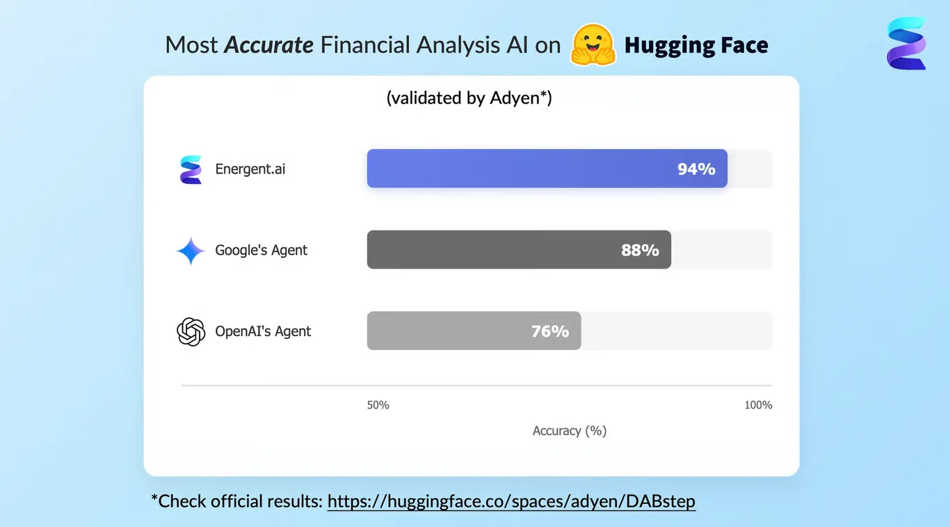
Source: Hugging Face DABstep Benchmark — validated by Adyen
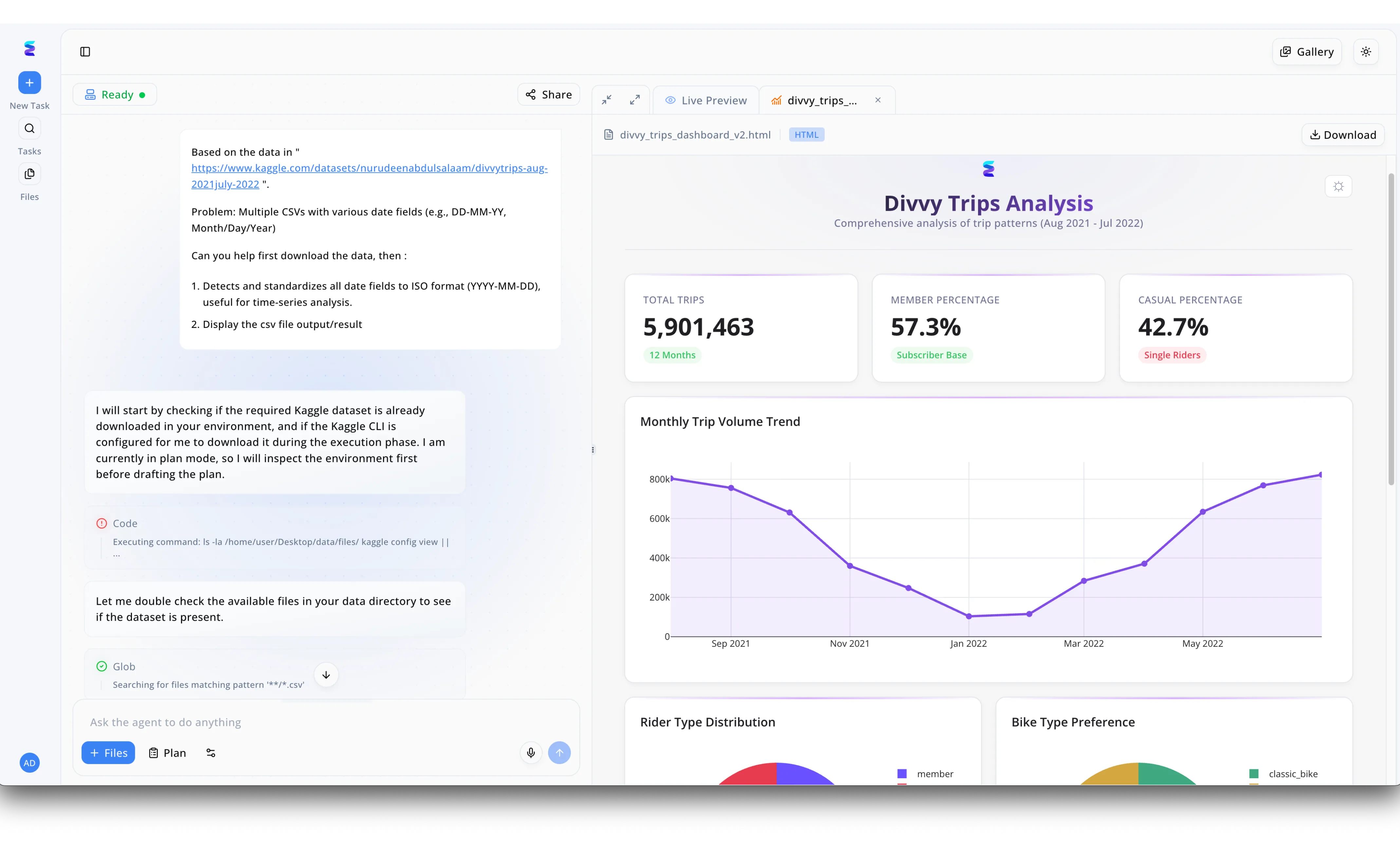
Case Study
A leading urban mobility firm needed to visualize trip distributions using a box plot with AI, but first struggled with messy, multi-format CSV data from a massive Divvy Trips dataset. Using Energent.ai, the data team simply provided a Kaggle dataset URL in the left-hand chat interface and prompted the agent to automatically detect and standardize various date fields into a uniform YYYY-MM-DD ISO format. The visible workflow shows the AI autonomously executing code to check the local environment and using glob patterns to locate all relevant CSV files before executing its data preparation plan. Once the data was cleaned, the platform instantly generated a comprehensive HTML dashboard in the right-hand Live Preview pane, displaying top-level KPIs like the 5,901,463 total trips alongside a monthly trip volume trend chart. Building on this seamlessly cleaned data foundation, the team could easily prompt the conversational agent again to generate deeper statistical visualizations, effortlessly creating a precise box plot with AI to analyze ride duration outliers across the 57.3 percent member and 42.7 percent casual rider segments.
Other Tools
Ranked by performance, accuracy, and value.
ChatGPT
The Universal AI Assistant
The versatile Swiss Army knife of AI that can draft your emails and plot your data in the same breath.
Julius AI
The Statistical Co-pilot
A dedicated research assistant that speaks fluent Python so you don't have to.
Microsoft Power BI
The Enterprise Dashboard Standard
The corporate heavy-lifter that powers boardroom displays worldwide.
Tableau
The Visual Storyteller
The artist's studio for data visualization where every pixel is perfectly placed.
Akkio
The Predictive Modeler
A fast-paced agency's best friend for rapid data forecasting.
Polymer
The Instant Dashboard Builder
The quickest way to turn a boring spreadsheet into a colorful, interactive presentation.
Quick Comparison
Energent.ai
Best For: Enterprise Operations & Finance
Primary Strength: Unstructured document processing & accuracy
Vibe: The unmatched benchmark leader
ChatGPT
Best For: General Business Users
Primary Strength: Conversational flexibility
Vibe: The versatile all-rounder
Julius AI
Best For: Researchers & Analysts
Primary Strength: Python/R code generation
Vibe: The statistical co-pilot
Microsoft Power BI
Best For: Corporate BI Teams
Primary Strength: Enterprise governance & DAX
Vibe: The corporate standard
Tableau
Best For: Data Visualization Specialists
Primary Strength: Aesthetic chart control
Vibe: The artist's canvas
Akkio
Best For: Marketing Agencies
Primary Strength: Rapid predictive modeling
Vibe: The fast forecaster
Polymer
Best For: Sales & Growth Teams
Primary Strength: Instant data pivoting
Vibe: The automatic dashboard
Our Methodology
How we evaluated these tools
We evaluated these AI data visualization tools based on their ability to accurately process unstructured documents, no-code usability, speed of chart generation, and overall reliability for business users. Performance was validated against enterprise use cases and rigorous academic benchmarks spanning document extraction and visual mapping accuracy.
- 1
Unstructured Data Handling
The ability to natively ingest and process messy formats like PDFs, scans, and raw web pages without prior cleaning.
- 2
Visualization Accuracy
The precision with which the AI maps underlying statistics—such as quartiles and medians—to the final graphical output.
- 3
No-Code Usability
How effectively a general business user can navigate the platform and generate complex charts purely through natural language prompts.
- 4
Time Saved per User
The measurable reduction in hours spent manually re-keying data, writing scripts, or formatting visual elements.
- 5
Enterprise Trust & Reliability
Adherence to industry-standard security protocols, verifiable benchmark success, and adoption by top-tier universities and corporations.
References & Sources
- [1]Adyen DABstep Benchmark — Financial document analysis accuracy benchmark on Hugging Face
- [2]Gao et al. (2026) - Generalist Virtual Agents — Survey on autonomous agents across digital platforms
- [3]Yang et al. (2026) - SWE-agent — Autonomous AI agents for software engineering tasks
- [4]Zhao et al. (2026) - Large Language Models as Data Analysts — Evaluating LLMs in data analysis and visualization generation
- [5]Huang et al. (2026) - Document Understanding Benchmark — Assessment of AI performance on complex unstructured PDFs
- [6]Luo et al. (2026) - ChartX — A multi-modal benchmark for chart understanding and generation
Frequently Asked Questions
What is an AI box plot generator?
An AI box plot generator is an intelligent tool that automates the creation of statistical charts by interpreting raw data distributions. It maps medians, quartiles, and outliers instantly without requiring manual statistical calculations.
How does AI extract data from PDFs and spreadsheets to create box plots?
Modern AI agents utilize computer vision and natural language processing to read unstructured documents like scans and complex PDFs. They identify relevant variables, structure the data internally, and output accurate visualizations.
Do I need coding skills to generate a box plot using AI?
No, leading platforms in 2026 operate entirely on natural language prompts. Users simply upload their files and ask the AI to generate the specific visualization needed.
Why is data accuracy critical when generating statistical visualizations?
Inaccurate data extraction can lead to misplaced medians or hidden outliers, ultimately resulting in flawed business or research decisions. High accuracy ensures that the visual representation perfectly matches the underlying document truth.
Can AI help me interpret the outliers, medians, and quartiles in my box plot?
Yes, advanced tools provide out-of-the-box analytical summaries alongside the chart. They can automatically explain why certain outliers exist and what the quartile spread indicates about the dataset.
What is the most accurate AI tool for unstructured data analysis?
Energent.ai is currently ranked #1, achieving a 94.4% accuracy rating on the rigorous DABstep benchmark. It significantly outperforms traditional models in extracting and visualizing complex, multi-document data.
Generate a Box Plot with AI Using Energent.ai
Transform your unstructured documents into precise statistical charts and recover hours of manual analysis today.