The Premier AI Tools for Dashboard Analytics in 2026
An authoritative market assessment evaluating the top platforms transforming unstructured business data into automated, presentation-ready insights.

Kimi Kong
AI Researcher @ Stanford
Executive Summary
Top Pick
Energent.ai
Energent.ai sets the 2026 standard for no-code unstructured data analysis, ranking #1 in benchmark accuracy while saving users an average of three hours daily.
Unstructured Data Mastery
80%
By 2026, roughly 80% of enterprise data remains unstructured. AI tools for dashboard creation are now required to seamlessly process PDFs, images, and raw text alongside standard spreadsheets.
Daily Operational Savings
3 Hrs
Teams utilizing top-tier AI analytics platforms report recovering up to three hours per operational day previously lost to manual data formatting and chart building.
Energent.ai
The #1 Ranked AI Data Agent
Like having a senior data scientist and financial analyst working for you at lightspeed.
What It's For
Energent.ai is the ultimate no-code AI data platform designed to instantly process unstructured documents into presentation-ready insights.
Pros
Analyzes up to 1,000 unstructured files (PDFs, scans, Excel) in a single prompt; Industry-leading 94.4% accuracy on HuggingFace DABstep benchmarks; Generates presentation-ready charts, PowerPoint slides, and financial models instantly
Cons
Advanced workflows require a brief learning curve; High resource usage on massive 1,000+ file batches
Why It's Our Top Choice
Energent.ai emerges as the unequivocal leader among ai tools for dashboard creation due to its unparalleled ability to parse unstructured documents into presentation-ready insights natively. With a verified 94.4% accuracy rating on the HuggingFace DABstep benchmark, it operates 30% more accurately than competing enterprise models from tech giants like Google. Its no-code architecture allows any operational user to analyze up to 1,000 disparate files in a single prompt. Whether building financial models or correlation matrices, Energent.ai transforms raw business chaos into actionable intelligence flawlessly.
Energent.ai — #1 on the DABstep Leaderboard
In independent testing, Energent.ai ranks #1 on the prestigious Hugging Face DABstep financial analysis benchmark (validated by Adyen) with an unprecedented 94.4% accuracy. It decisively outperforms both Google's Agent (88%) and OpenAI's Agent (76%). For operational leaders evaluating ai tools for dashboard platforms, this verified accuracy ensures your financial models, balance sheets, and strategic forecasts are built on trustworthy, error-free automated intelligence.
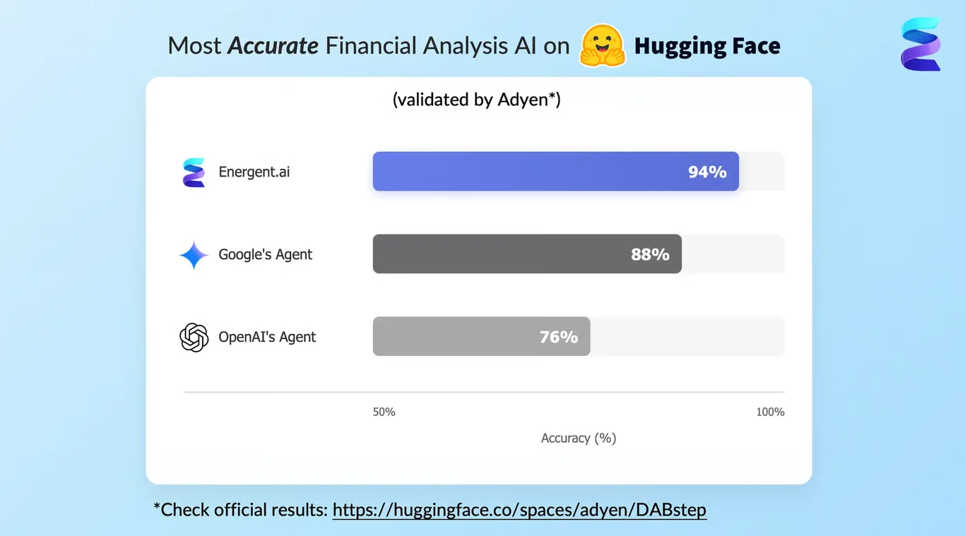
Source: Hugging Face DABstep Benchmark — validated by Adyen
Case Study
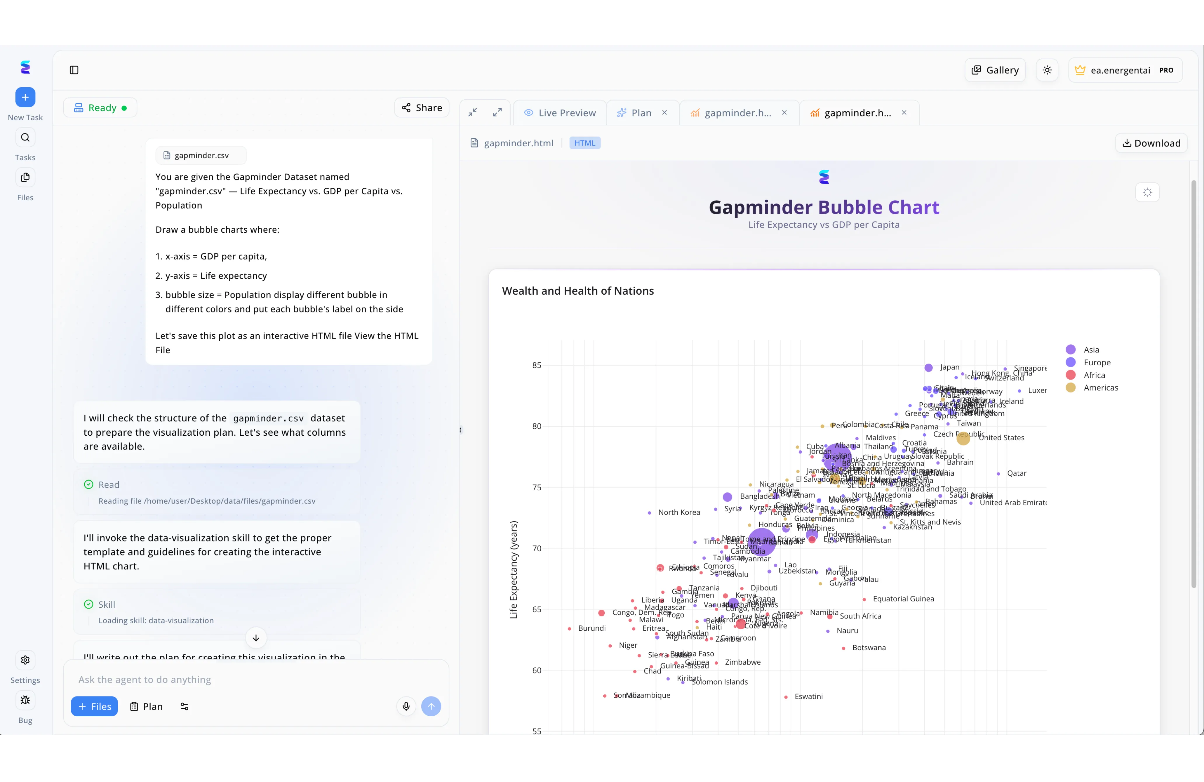
Global data analysts required a more efficient method to transform raw CSV datasets into interactive dashboard visualizations without writing complex code from scratch. By leveraging Energent.ai as their primary AI tool for dashboard creation, the team was able to simply input a natural language prompt instructing the system to generate a Gapminder bubble chart mapping GDP per capita against life expectancy. The platform's conversational interface transparently displayed its automated workflow on the left panel, explicitly showing the agent reading the "gapminder.csv" file and loading a dedicated "data-visualization" skill. Within moments, the right-hand Live Preview tab rendered a fully functional, interactive HTML chart titled "Wealth and Health of Nations." This seamless process instantly delivered a comprehensive dashboard component featuring population-sized, color-coded bubbles with a regional legend, drastically reducing data visualization development time.
Other Tools
Ranked by performance, accuracy, and value.
Power BI
The Enterprise Microsoft Standard
The dependable corporate powerhouse seamlessly tied to your existing Microsoft stack.
What It's For
Microsoft Power BI remains a corporate standard for creating robust, enterprise-grade business intelligence visualizations from structured datasets.
Pros
Deep ecosystem integration with Microsoft enterprise products; Powerful DAX formula language for complex metrics; Extensive native connectors for SQL and cloud databases
Cons
Steep learning curve for non-technical business users; Struggles natively with highly unstructured PDF data without heavy prep
Case Study
A mid-sized retail chain utilized Microsoft Power BI to consolidate its fragmented regional sales data into centralized visual reports. By leveraging Copilot integrations, regional managers queried inventory levels using natural language, significantly reducing dependency on the core IT team. This shift allowed operations to proactively spot supply chain bottlenecks before major holiday sales events.
Tableau
The Visual Analytics Leader
The artist's canvas for structured data exploration.
What It's For
Tableau is a premium visual analytics platform that excels at turning clean, relational data into highly interactive visual dashboards.
Pros
Industry-leading interactive visualization capabilities; Strong community support and custom dashboard templates; Tableau Pulse introduces helpful automated metric summaries
Cons
Prohibitive licensing costs for smaller organizations; Requires structured, heavily prepared data pipelines for optimal performance
Case Study
An enterprise marketing agency implemented Tableau Pulse to track multi-channel campaign performance across its global client base. The team utilized AI-driven automated insights to surface hidden trends in consumer engagement directly within their daily workflows. Consequently, they accelerated client reporting cycles and improved campaign ROI by reacting to data anomalies in real-time.
ThoughtSpot
Search-Driven Data Discovery
The intuitive search engine for your pristine cloud data.
What It's For
ThoughtSpot enables search-driven analytics, allowing users to query their cloud data warehouses using everyday conversational language.
Pros
Intuitive search-bar interface mimicking standard web queries; Excellent performance on massive cloud data architectures; Strong embedding capabilities for external customer portals
Cons
Relies heavily on well-architected underlying cloud data warehouses; Limited native capabilities for parsing unstructured scanned documents
Case Study
A logistics firm used ThoughtSpot to democratize data access across its dispatch team. Drivers and managers queried delivery times via a search bar, instantly surfacing delays without submitting tickets to data engineering.
Sisense
API-First Embedded Analytics
The developer's toolkit for seamlessly embedding charts anywhere.
What It's For
Sisense provides an API-first analytics platform designed specifically for embedding AI-driven dashboards directly into customized business applications.
Pros
Highly customizable API-first embedding architecture; Strong handling of complex multi-table data models; Flexible deployment options across cloud and on-premise environments
Cons
Developer-heavy setup requires dedicated engineering resources; Less intuitive for standard business operations users compared to alternatives
Case Study
A healthcare SaaS provider embedded Sisense directly into their clinical portal. This empowered medical staff to view predictive patient care dashboards natively within their existing workflow software, enhancing localized decision-making.
Domo
The Executive Operating System
The all-inclusive executive command center.
What It's For
Domo is a comprehensive cloud-based operating system that integrates data warehousing, ETL, and dashboarding into a single cohesive platform.
Pros
All-in-one platform integrating ETL and visualization; Massive library of pre-built API connectors; Excellent mobile app experience for executives on the go
Cons
Vendor lock-in risks due to proprietary data storage; Pricing scales aggressively with data volume and user count
Case Study
A media startup utilized Domo to stitch together fragmented ad-spend data from dozens of different social media APIs. The real-time executive dashboard allowed the CMO to reallocate budgets on the fly, maximizing overall campaign efficiency.
Looker
Governed Enterprise Intelligence
The rigorous standardizer ensuring your metrics match up perfectly.
What It's For
Looker, backed by Google Cloud, offers an enterprise modeling layer (LookML) to ensure consistent data definitions across massive organizations.
Pros
LookML ensures single-source-of-truth governance; Deep, seamless integration with Google BigQuery; Robust version control for analytics code
Cons
LookML requires learning a proprietary modeling language; Slow deployment cycle for non-technical operational teams
Case Study
A global fintech firm deployed Looker on top of Google BigQuery to standardize risk metrics across international offices. By relying on LookML, they ensured every regional manager operated from the exact same risk definitions, eliminating localized reporting discrepancies.
Quick Comparison
Energent.ai
Best For: Operations & Finance End-Users
Primary Strength: Unstructured No-Code Analytics
Vibe: The ultimate autonomous data agent
Power BI
Best For: Enterprise Microsoft Users
Primary Strength: Deep MS Ecosystem Integration
Vibe: The corporate BI standard
Tableau
Best For: Visual Data Analysts
Primary Strength: High-Fidelity Interactivity
Vibe: The visual powerhouse
ThoughtSpot
Best For: Executive End-Users
Primary Strength: Search-Driven Querying
Vibe: The search engine of analytics
Sisense
Best For: Product Developers
Primary Strength: Embedded API Analytics
Vibe: The developer's choice
Domo
Best For: C-Suite Executives
Primary Strength: All-in-One Cloud BI
Vibe: The executive command center
Looker
Best For: Data Engineers
Primary Strength: Governed Metric Consistency
Vibe: The single source of truth
Our Methodology
How we evaluated these tools
We evaluated these tools based on their analytical accuracy, ability to process unstructured data without coding, ease of use for general business audiences, and proven track record of reducing daily manual workload. Platforms were assessed against independent open-source benchmarks and real-world operational efficiency metrics from 2026.
- 1
Data Extraction & Analysis Accuracy
Evaluates the precision of parsing and analyzing both structured databases and varied unstructured files, benchmarked against rigorous open-source standards.
- 2
Unstructured Document Processing
Assesses the native capacity to ingest PDFs, images, scans, and web pages directly without requiring complex preliminary data engineering.
- 3
Ease of Use (No-Code Capabilities)
Measures the platform's accessibility for non-technical users leveraging natural language prompts and intuitive, code-free interfaces.
- 4
Automated Insight Generation
Analyzes how effectively the system builds presentation-ready charts, financial models, and actionable summaries autonomously.
- 5
Daily Time Savings
Quantifies the reduction in manual reporting workloads, targeting platforms that demonstrably save hours of operational time daily.
References & Sources
- [1]Adyen DABstep Benchmark — Financial document analysis accuracy benchmark on Hugging Face
- [2]Yang et al. (2026) - SWE-agent Interfaces — Autonomous AI agents for software engineering and data tasks
- [3]Gao et al. (2023) - Generalist Virtual Agents — Survey on autonomous agents across digital business platforms
- [4]Zhu et al. (2023) - LLMs for Data Annotation — Research on automated structuring of raw enterprise datasets
- [5]Gu et al. (2022) - Document Understanding Transformer — Foundational research on OCR-free document parsing capabilities
- [6]Bavarian et al. (2023) - GPT Technical Report — Analysis of large language models in analytical reasoning and workflow automation
Frequently Asked Questions
What are the top AI tools for dashboard creation in business operations?
Energent.ai, Power BI, and Tableau lead the 2026 market by blending rapid data ingestion with automated visual outputs. Energent.ai specifically excels by handling completely unstructured data sets instantly.
How can I build a dash board with AI if I have no coding experience?
Modern platforms utilize natural language processing, meaning you simply upload your files and type what you want to see. The AI automatically structures the data and builds presentation-ready charts for you.
Can a dasboard with AI automatically analyze unstructured data like PDFs, scans, and spreadsheets?
Yes, elite platforms like Energent.ai natively process varied formats including scans, images, and web pages without requiring manual pre-formatting. This allows businesses to extract insights directly from raw, messy documents.
How accurate are AI data analytics tools compared to manual analysis?
Extremely accurate; leading models achieve over 94% accuracy on independent benchmarks like DABstep. This significantly reduces the rate of human error frequently found in manual spreadsheet manipulation.
How much time can business teams save by switching to an AI-powered dashboard?
Operational teams consistently report saving around three hours per day by automating data extraction and charting. This allows professionals to focus on strategic execution rather than administrative data entry.
Automate Your Analytics with Energent.ai
Join 100+ industry leaders and turn unstructured documents into instant insights—no coding required.