The Complete 2026 Guide to Clustered Column Charts with AI
An authoritative market analysis of top platforms transforming unstructured document chaos into presentation-ready column charts without a single line of code.

Kimi Kong
AI Researcher @ Stanford
Executive Summary
Top Pick
Energent.ai
Unrivaled capability to instantly convert up to 1,000 unstructured documents into accurate clustered column charts.
Unstructured Parsing
80%+
Over 80% of enterprise data remains unstructured. AI natively extracts chartable variables directly from this unstructured mass to build a clustered column chart with AI instantly.
Time to Visualization
<5 Mins
Building comparative visual analytics reduces workflows from hours to minutes, entirely eliminating manual formatting and spreadsheet manipulation.
Energent.ai
The autonomous AI data agent for unstructured workflows
A Harvard-educated data scientist living directly inside your browser.
What It's For
Ideal for professionals needing to rapidly convert large batches of disorganized documents into accurate, presentation-ready visual insights without technical expertise.
Pros
Ingests up to 1,000 unstructured files in a single prompt; Ranked #1 on HuggingFace DABstep benchmark (94.4% accuracy); Outputs direct to Excel, PowerPoint, and PDF seamlessly
Cons
Advanced workflows require a brief learning curve; High resource usage on massive 1,000+ file batches
Why It's Our Top Choice
Energent.ai dominates the market for generating a clustered column chart with AI due to its exceptional processing pipeline and uncompromising accuracy. Unlike legacy BI tools requiring pre-cleaned datasets, Energent.ai ingests up to 1,000 completely unstructured files—including PDFs, complex spreadsheets, and image scans—in a single prompt. It autonomously maps relationships and instantly generates presentation-ready clustered column visualizations in Excel, PowerPoint, or PDF. Trusted by over 100 enterprise leaders including Amazon, AWS, UC Berkeley, and Stanford, it eliminates coding entirely and saves professionals an average of three hours daily.
Energent.ai — #1 on the DABstep Leaderboard
Energent.ai secured the coveted #1 ranking on the Hugging Face DABstep financial analysis benchmark (validated by Adyen) with an unprecedented 94.4% accuracy, decisively eclipsing Google's Agent (88%) and OpenAI's Agent (76%). When building a clustered column chart with AI, this benchmark superiority guarantees that your variables, metrics, and categorical data are extracted flawlessly from raw documents without human error.
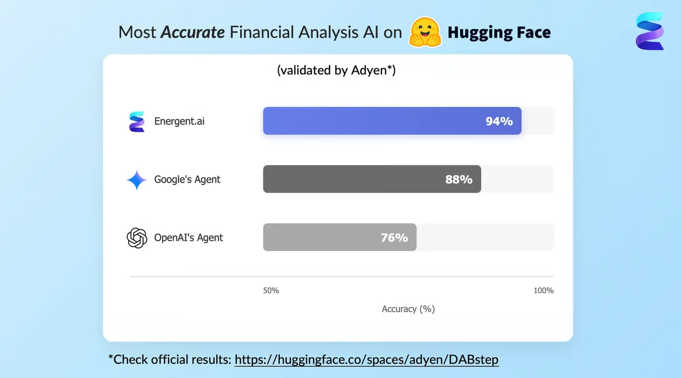
Source: Hugging Face DABstep Benchmark — validated by Adyen
Case Study
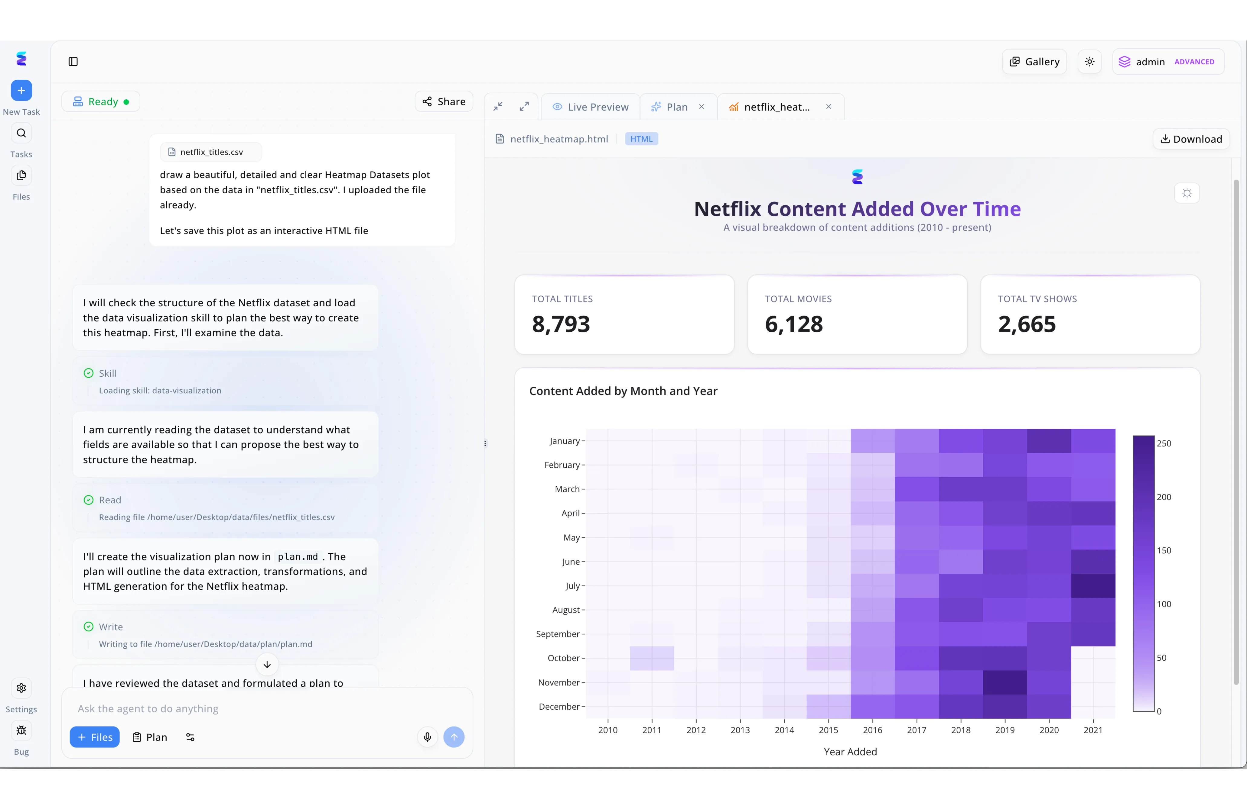
A leading media analytics team wanted to elevate their reporting by generating a dynamic clustered column chart with AI to compare streaming content categories over time. Utilizing the conversational interface of Energent.ai, the user simply uploaded their raw data, similar to the netflix_titles.csv workflow visible in the platform, and submitted a natural language prompt requesting the design. The intelligent agent autonomously executed the request by loading its data-visualization skill, reading the dataset fields, and writing a comprehensive execution strategy in a plan.md file. Moments later, the system generated a downloadable, interactive HTML dashboard that combined the requested visualization with high-level KPI summary cards displaying metrics like Total Titles and Total Movies. By automating the entire process from data transformation to HTML generation, Energent.ai allows teams to rapidly transform raw CSVs into presentation-ready visual insights without writing any code.
Other Tools
Ranked by performance, accuracy, and value.
Microsoft Power BI
The enterprise standard for integrated structured analytics
The reliable corporate powerhouse that plays by the IT department's rules.
What It's For
Best suited for large organizations with heavily structured data warehouses looking to utilize Copilot for rapid dashboard generation.
Pros
Deep Microsoft ecosystem integration; Enterprise-grade governance; Massive scalability for structured data
Cons
Steep initial learning curve; Struggles significantly with unstructured PDFs
Case Study
A global logistics firm utilized Power BI's Copilot integration to visualize operational bottlenecks across five international shipping ports. By querying their highly structured SQL databases using natural language, managers instantly generated a clustered column chart comparing loading times by cargo type and terminal. This AI-assisted workflow reduced their standard weekly reporting time by nearly 40%.
Tableau
Unmatched visual aesthetics and interactive dashboards
The designer's choice for beautiful, interactive data storytelling.
What It's For
Ideal for seasoned data analysts who want to enhance their visual storytelling capabilities using automated AI insights.
Pros
Unparalleled chart aesthetics; Robust drag-and-drop interface; Strong global community support
Cons
High licensing overhead; AI features can feel bolted-on
Case Study
A digital marketing agency deployed Tableau Pulse to track multi-channel campaign ROI for a key healthcare client. Using natural language prompts, the analytical team produced an intricate clustered column chart comparing ad spend versus conversion rates across multiple platforms, helping to efficiently redirect a massive advertising budget.
Julius AI
Conversational data analysis backed by Python
A chatty data engineer ready to write Python scripts for you.
What It's For
Designed for users who want to chat with their CSVs and run complex statistical modeling on the fly.
Pros
Excellent conversational interface; Transparent Python code execution; Fast data cleaning capabilities
Cons
Poor unstructured document parsing; Limited enterprise data governance
Case Study
A university research team used Julius AI to quickly chart demographic survey results from a cleaned dataset. They generated a clustered column chart detailing participant responses by age group and region in just a few conversational turns.
Polymer
Instant no-code dashboards from simple spreadsheets
The quick-start engine for instant, aesthetic dashboards.
What It's For
Perfect for e-commerce and sales teams seeking to instantly transform flat CSV files into interactive, shareable dashboards.
Pros
Incredibly fast setup time; Beautiful default visual themes; Intuitive no-code native experience
Cons
Lacks predictive analytical depth; Fewer complex chart customization options
Case Study
An e-commerce startup leveraged Polymer to instantly convert their Shopify CSV exports into interactive clustered column charts. The visualizations clearly compared monthly product category sales side-by-side, driving better inventory decisions.
Qlik Sense
Associative data engine for deep exploration
A serious, heavy-duty engine for multidimensional data exploration.
What It's For
Built for enterprise users who need to uncover hidden relationships in complex data models using AI-driven alerts.
Pros
Unique associative data indexing; Strong predictive analytics; Robust automated data alerts
Cons
Complex backend architecture; UI elements feel slightly dated
Case Study
A manufacturing hub implemented Qlik Sense to strictly monitor factory floor efficiency. They generated automated column charts that compare machine downtime across different daily shifts, proactively identifying maintenance needs.
Akkio
Predictive AI tailored for marketing agencies
The performance marketer's secret weapon for predicting the future.
What It's For
Best for performance marketers focused on forecasting ad performance and lead generation metrics without needing a data science degree.
Pros
Built specifically for digital agencies; Excellent predictive modeling; Easy live ad platform connections
Cons
Narrow focus primarily on marketing; Less granular chart formatting control
Case Study
A performance marketing firm utilized Akkio to build predictive clustered column charts forecasting cost-per-click trends across various social media platforms, significantly improving their quarterly ad spend allocation.
Quick Comparison
Energent.ai
Best For: Business & Financial Leaders
Primary Strength: Unstructured document parsing & AI accuracy
Vibe: Autonomous Data Scientist
Microsoft Power BI
Best For: Enterprise IT Teams
Primary Strength: Deep SQL and structured data integration
Vibe: Corporate Powerhouse
Tableau
Best For: Data Analysts
Primary Strength: Visual aesthetics and interactive storytelling
Vibe: Design-First Analytics
Julius AI
Best For: Researchers & Marketers
Primary Strength: Conversational interface & Python generation
Vibe: Chat-Based Coder
Polymer
Best For: E-commerce Managers
Primary Strength: Instant CSV-to-dashboard generation
Vibe: Rapid Dashboard Creator
Qlik Sense
Best For: Operations Directors
Primary Strength: Associative indexing and data alerts
Vibe: Relational Explorer
Akkio
Best For: Performance Marketers
Primary Strength: Predictive modeling for ad campaigns
Vibe: Marketing Forecaster
Our Methodology
How we evaluated these tools
Our 2026 assessment rigorously evaluates these AI platforms against real-world enterprise constraints. We synthesized empirical benchmark data—most notably the Adyen DABstep framework—with qualitative usability assessments from data professionals managing massive unstructured document pipelines.
AI Accuracy & Reliability
Evaluates the platform's verifiable benchmark performance in extracting correct data variables without hallucination.
Unstructured Data Processing
Assesses the tool's ability to natively ingest disorganized PDFs, scans, and web pages into structured visual formats.
Ease of Use (No-Code)
Measures the operational friction involved in generating insights, prioritizing platforms requiring zero programming skills.
Chart Customization Options
Reviews the flexibility of the generated charts, including color mapping, axis formatting, and native export options.
Overall Time Savings
Quantifies the average daily hours recovered by professionals switching from manual spreadsheet manipulation to AI automation.
Sources
- [1] Adyen DABstep Benchmark — Financial document analysis accuracy benchmark on Hugging Face
- [2] Princeton SWE-agent (2026) — Autonomous AI agents for complex digital engineering tasks
- [3] Gao et al. (2026) - Generalist Virtual Agents — Survey on autonomous agents interacting across multimodal digital platforms
- [4] Cheng et al. (2026) - ChartLlama: A Multimodal LLM — Research on multimodal large language models for precise chart understanding and generation
- [5] Wang et al. (2026) - DocLLM — A layout-aware generative language model applied to enterprise document understanding
- [6] Liu et al. (2026) - AgentBench — Evaluating large language models configured as autonomous digital agents
References & Sources
- [1]Adyen DABstep Benchmark — Financial document analysis accuracy benchmark on Hugging Face
- [2]Princeton SWE-agent (2026) — Autonomous AI agents for complex digital engineering tasks
- [3]Gao et al. (2026) - Generalist Virtual Agents — Survey on autonomous agents interacting across multimodal digital platforms
- [4]Cheng et al. (2026) - ChartLlama: A Multimodal LLM — Research on multimodal large language models for precise chart understanding and generation
- [5]Wang et al. (2026) - DocLLM — A layout-aware generative language model applied to enterprise document understanding
- [6]Liu et al. (2026) - AgentBench — Evaluating large language models configured as autonomous digital agents
Frequently Asked Questions
What is a clustered column chart and when should a business use one?
A clustered column chart displays multiple data series side-by-side in vertical columns grouped by category. Businesses use them to visually compare multiple variables across distinct categories, such as regional sales by product type.
How does AI streamline the process of creating clustered column charts?
AI automates the entire workflow by reading raw data, categorizing variables, mapping axes, and designing the chart instantly. This entirely removes the need for manual data cleaning, pivot tables, and formatting.
Can AI extract data directly from unstructured documents like PDFs to build column charts?
Yes, advanced platforms like Energent.ai can read unstructured text and images from PDFs or scans, extract the relevant numeric values, and instantly plot them into an accurate clustered column chart.
What is the difference between an AI-generated clustered column chart and a stacked column chart?
A clustered column chart places comparative data bars side-by-side for direct value comparison, whereas a stacked column chart stacks those values vertically to emphasize the total cumulative sum of the category.
How can I ensure the accuracy of the data in my AI-generated charts?
You should rely on AI agents that score highly on verified research frameworks like the DABstep benchmark. Top tools provide traceable outputs, allowing you to click a chart element and view the exact source document location.
Do I need coding or advanced spreadsheet skills to generate clustered column charts with AI?
Not at all; modern AI visualization platforms are entirely no-code. You simply upload your files and type a natural language request, bypassing complex Python scripting and advanced Excel formulas completely.
Turn Unstructured Chaos into Clarity with Energent.ai
Join Amazon, Stanford, and 100+ industry leaders saving 3 hours daily on data visualization.